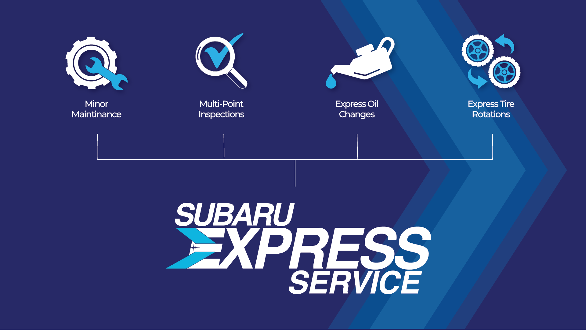
Some of the best branding work doesn't come from a flashy new logo. It comes from solving a practical problem: how do you get one clear message to land the same way across dozens of locations at once? That was the challenge behind Subaru of New England's Express Service campaign, and it's a good example of what design can actually do for a business beyond looking nice.
Express Service is Subaru of New England's walk-in maintenance program: oil changes, tire rotations, inspections, and other routine work with no appointment needed. The idea itself is simple. The hard part was communicating it consistently across a network of 65 retailers spanning six states, each with its own signage, staff, and local marketing habits. Without a shared visual system, that kind of message tends to drift. One location explains it one way, another explains it differently, and the "just drive up" simplicity the program depends on gets lost in the noise.
I designed a set of simplified icons to represent each service under the Express Service umbrella. Oil changes, tire rotation, inspections, battery and wiper service, each got its own clean, simple mark instead of a paragraph of copy explaining what it was. The goal was for a customer to understand the offer in about two seconds, without needing to read anything at all.
Just as important as the icons themselves was building them as a system, not a one-off set of graphics. Every icon needed to work at small sizes and in different placements, from a website to printed signage in a service bay. And because the campaign had to run across 65 individual retailers, I built a personalized version for each location so every dealership could carry its own branded materials while staying visually consistent with the rest of the network.
Three months after launch, Express Service utilization was up 60% across the network. The clarity of the icon system played a direct role in that. When customers can understand an offer instantly, they act on it instantly, and that's exactly what a walk-in, no-appointment model depends on. The icon system has also outlasted the original campaign: it's been reused in later Subaru of New England promotions, which is really the mark of a good design system. It doesn't get thrown away after one use.
You don't need a bigger logo or a flashier campaign to get better results. Often what's missing is clarity: a way for people to understand what you're offering in the time it takes to glance at a sign or scroll past a post. That's true whether you're running one location or sixty-five.
Want a visual system built to scale with your business?